

Ergonomic Office Chair Spine Pressure Simulation Video Ad: A DTC Creative Guide

Summarize with
Summary
Learn how to plan an ergonomic office chair spine pressure simulation video ad with 3D visuals, posture contrasts, proof-led scenes, and scalable creative testing.
By adsturbo.ai | Published 2026-11-12 | Updated 2026-11-12
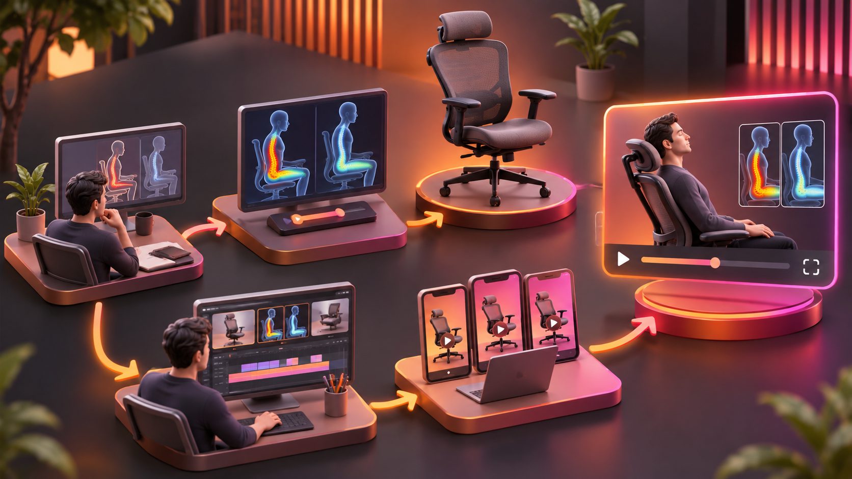
An ergonomic office chair spine pressure simulation video ad turns an invisible buying reason—support during long sitting—into a visual story. Instead of showing only fabric, controls, and a rotating product shot, the ad compares posture, pressure zones, movement, and support in a sequence that helps shoppers understand why the chair may be worth a premium price.
What is a spine pressure simulation video ad?
A spine pressure simulation video ad is a product-focused visual that uses simplified 3D anatomy, pressure-color overlays, posture comparisons, and chair movement to explain how a seating design supports the body.
The strongest versions do not present a medical diagnosis. They visualize a product mechanism or seating experience: for example, a slouched position versus a more supported position, or a rigid backrest versus a backrest that follows movement. This distinction matters because ergonomic advertising should explain a product benefit without making unsupported claims about curing pain or preventing injury.
Existing office-chair campaigns commonly use dynamic backrest motion, close-up engineering shots, and everyday work scenarios. Haworth’s Fern animation, for example, presents weight distribution through a 3D product film, while Humanscale’s Path campaign combines product details with visuals of support adapting to the user. (richterstudios.com)
Why this format suits high-ticket DTC office chairs
A premium office chair is difficult to sell through a static image because many important benefits are conditional. Buyers want to know what happens when they lean back, shift position, work at a laptop, or sit for a long meeting.
A pressure-simulation creative can bridge that information gap in three ways:
- Make an invisible benefit visible: Use a restrained heat map or force-flow animation to show where support is concentrated.
- Connect engineering to behavior: Show how the chair responds when the user reclines, reaches forward, or changes posture.
- Reduce explanation time: A visual comparison can communicate faster than a paragraph describing lumbar support, pelvic positioning, or flexible suspension.
Current office-chair ad examples tend to lead with comfort, movement, fit, and the workday problem rather than starting with a technical feature list. One analyzed Meta ad collection also shows that “Shop Now” and “Learn More” are common calls to action, while stronger hooks describe what the support does during real use. (sprites.ai)
That suggests a useful creative principle: show the body problem first, then reveal the chair mechanism that addresses the product-design problem.
The pressure-storyboard matrix: an original framework for planning the ad
A practical way to structure this type of creative is to map every scene across four layers:
| Layer | Viewer question | Visual treatment |
|---|---|---|
| Posture | What changes when the person sits? | Side-profile silhouette or live-action comparison |
| Pressure | Where is force or contact concentrated? | Soft color gradient, not alarming red anatomy |
| Mechanism | What part of the chair creates the difference? | Lumbar panel, backrest flex, seat edge, or recline hinge |
| Proof | How can the viewer verify the claim? | Adjustment demo, close-up movement, measurement, or clear product detail |
This matrix prevents a common weakness in technical chair ads: showing a dramatic spine graphic without connecting it to a visible product feature.
Suggested 30-second sequence
-
0–3 seconds: Interrupt with a recognizable work posture
Show a person leaning toward a laptop with shoulders rounded and the pelvis rotated backward. Overlay a simple question: “What happens to your posture after hours at a desk?” -
3–8 seconds: Introduce the comparison
Split the screen into two profiles: a basic chair and the featured ergonomic chair. Keep clothing, desk height, camera angle, and sitting duration visually consistent. -
8–14 seconds: Add the spine and pressure visualization
Use a translucent body layer and a simplified spine line. Animate contact zones rather than implying clinical measurement. Label the visual clearly as a “design visualization” if the footage could be mistaken for laboratory data. -
14–21 seconds: Reveal the mechanism
Cut to the chair’s lumbar area, backrest, seat pan, or recline action. Use arrows to show movement and support. The mechanism should explain the visual difference. -
21–26 seconds: Demonstrate adjustment or movement
Show the user reclining, shifting, or adjusting the chair. Dynamic accommodation is a valuable message because office work involves more than one fixed posture. Recent research also emphasizes that ergonomic benefits depend on both adjustability and whether users can operate the controls effectively. (arxiv.org) -
26–30 seconds: Close with a product-led CTA
Use a calm line such as “See how the support system moves” or “Explore the fit for your workday.” Avoid promising pain relief unless the brand has appropriate evidence and compliant substantiation.
For a broader production workflow, an ecommerce team can combine this concept with a structured Meta video ad script framework and then produce multiple opening hooks without changing the core product demonstration.
How to make the simulation credible without overclaiming
The goal is not to make the animation look medical. The goal is to make the product logic understandable.
Use these safeguards:
- Show relative differences, not invented numbers. If you do not have pressure-mapping data, avoid percentages, force values, or claims such as “reduces spinal load by 40%.”
- Use neutral visual language. “Support zone,” “contact area,” and “movement path” are safer than “damage,” “compression,” or “injury prevention.”
- Keep the same camera geometry. A tilted camera can make one posture look more extreme than another.
- Show adjustment instructions. A chair cannot support every user identically without correct setup.
- Separate product facts from visual interpretation. The chair’s materials, adjustment range, and mechanism should be stated only when verified by the brand.
This approach is especially important because many shoppers are skeptical of exaggerated “back pain” advertising. The creative should demonstrate what the chair does, not diagnose the viewer.
How to turn one concept into a DTC testing system
One simulation video can become a controlled creative batch by changing only one variable at a time:
- Hook test: “Your chair may be changing your posture” versus “Watch what happens when you lean forward.”
- Visual test: 3D spine overlay versus pressure gradient versus clean split-screen posture comparison.
- Audience test: Remote workers, gamers, executives, students, or shared-office teams.
- Proof test: Mechanism close-up versus adjustment demonstration versus user POV.
- CTA test: “Explore support” versus “Compare the fit” versus “Build your setup.”
A useful production rule is to preserve the same product shots and change the first three seconds, headline, and end card. This makes performance comparisons more meaningful than producing five completely different ads.
AdsTurbo can support this type of workflow with product video generation, Ad Clone, motion control, subtitles, video translation, and clip-by-clip editing. For source footage that needs clearer detail before the simulation overlay is added, an AI video enhancer can help prepare the visual asset for export. The output should still be checked for anatomical clarity, product consistency, and claim accuracy.
Common mistakes to avoid
Starting with a chair spin
A rotating product shot may establish appearance, but it does not answer why the chair deserves attention. Lead with a workday posture or movement problem, then reveal the product.
Making the anatomy too dramatic
Glowing red bones, crushed vertebrae, and fear-based sound design can reduce trust. Use anatomy as an explanatory layer, not as a threat.
Showing features without a cause-and-effect link
Listing “adjustable lumbar support” is weaker than showing the adjustment, the user’s posture, and the resulting visual change in one continuous sequence.
Forgetting sound-off viewing
Office-chair ads often run on social feeds where viewers may not hear narration. Burned-in captions, readable labels, and clear visual sequencing are essential. Product-video guidance for office chairs similarly emphasizes short scenes, captions, and multiple hooks for testing. (framenotion.com)
Frequently asked questions
Should a spine simulation be 2D or 3D?
Use 2D for fast educational comparisons and 3D when the product mechanism, internal structure, or movement path needs more depth. A hybrid format is often clearer than a fully anatomical animation.
Can the ad claim to reduce back pain?
Only when the claim is supported by appropriate evidence and complies with the advertising rules for the target market. Otherwise, describe visible support, posture, adjustability, and product design without presenting a medical outcome.
What length works for a paid social version?
A 15-second cut can focus on one posture contrast and one mechanism. A 30-second version allows a hook, comparison, simulation, product reveal, and CTA. Test both rather than assuming one duration fits every platform.
What should be tested first?
Test the first three seconds first. If the opening fails to identify a recognizable desk-work problem, improvements to the final CTA are unlikely to compensate.
How can brands localize the concept?
Keep the visual sequence consistent while adapting captions, voiceover, product benefits, and CTA language. AdsTurbo supports video translation and subtitle generation for localized versions, allowing the same core demonstration to be adapted for multiple markets.